How to Create Custom Graphics with Jetpack Compose and Kotlin on Android
While developing a mobile application with Kotlin + Jetpack Compose, I have needed to draw some special drawings. At first, I looked at the documentations but it was too limited to understand and create complex drawings. After some research and with the help of AI, I have created my special drawings using Compose.
I wanted to share them here because there are not many examples of it. I mean; how to use canvas and some drawing functions. So, lets see some examples from my drawings.
- Draw Circle and put Icon and Text in it if needed

@Composable
fun DrawCircleGraphWithIcon(value: Int,
                            color: Color,
                            remainingPartColor: Color = ColorTextFieldContainerDefault,
                            iconDrawable: Int? = null,
                            text : String? = null,
                            contentColor : Color = ColorTextPrimary,
                            backgroundColor : Color = ColorBackground) {

    var radius by remember { mutableFloatStateOf(0f) }
    var canvasWidth by remember { mutableFloatStateOf(0f) }

    Box(modifier = Modifier
        .fillMaxSize()
        .background(backgroundColor)) {
        Canvas(modifier = Modifier.fillMaxSize()) {
            canvasWidth = size.width
            val canvasHeight = size.height

            val centerX = canvasWidth / 2f
            val centerY = canvasHeight / 2f
            radius = canvasWidth / 2.3f //arrange circle size


            val sweepAngle = (value / 100f) * 360f

            // Draw the incomplete part of the circle
            drawArc(
                color = remainingPartColor,
                startAngle = sweepAngle,
                sweepAngle = 360f - sweepAngle,
                useCenter = false,
                topLeft = Offset(centerX - radius, centerY - radius),
                size = Size(radius * 2, radius * 2),
                style = Stroke(width = radius/9f)//arrange stroke size according to radius
            )

            // Draw the completed part of the circle
            drawArc(
                color = color,
                startAngle = 0f,
                sweepAngle = sweepAngle,
                useCenter = false,
                topLeft = Offset(centerX - radius, centerY - radius),
                size = Size(radius * 2, radius * 2),
                style = Stroke(width = radius/6f)//arrange stroke size according to radius
            )
        }

        Column(modifier = Modifier.height(canvasWidth.dp).width(canvasWidth.dp),
            horizontalAlignment = Alignment.CenterHorizontally,
            verticalArrangement = Arrangement.Center){
            if(iconDrawable != null){
                Icon(
                    painter = painterResource(id = iconDrawable),
                    contentDescription = null,
                    modifier = Modifier
                        .size((radius / 4).dp),//arrange stroke size according to radius
                    tint = color

                )
            }


            if(text != null){
                if (contentColor != null) {
                    Text(text, fontSize = (radius / 16).sp,
                        color = contentColor,
                        fontWeight = FontWeight.Bold,
                        modifier = Modifier.padding(top = (radius / 24).dp))//arrange stroke size according to radius
                }
            }

        }

    }
}
This is my special drawing function. I coded it for general usage across all the screens that I will use it. It takes parent composable’s width to draw circle. So ensure parent’s size and try to size parent as square if possible.
Additionally, I may need to include an icon and text in some screens, which can be easily done while using it. The same scenario applies to text. If you want you can design it according to your needs. I plan to define parameters for the circle lines.
2. Draw line with an angle and animate a dot on it

import android.graphics.Path
import androidx.compose.animation.core.Animatable
import androidx.compose.animation.core.AnimationSpec
import androidx.compose.animation.core.InfiniteRepeatableSpec
import androidx.compose.animation.core.LinearEasing
import androidx.compose.animation.core.RepeatMode
import androidx.compose.animation.core.infiniteRepeatable
import androidx.compose.animation.core.tween
import androidx.compose.foundation.Canvas
import androidx.compose.foundation.layout.Box
import androidx.compose.foundation.layout.padding
import androidx.compose.foundation.layout.size
import androidx.compose.runtime.Composable
import androidx.compose.runtime.LaunchedEffect
import androidx.compose.runtime.remember
import androidx.compose.ui.Alignment
import androidx.compose.ui.Modifier
import androidx.compose.ui.geometry.Offset
import androidx.compose.ui.graphics.Brush
import androidx.compose.ui.graphics.Color
import androidx.compose.ui.graphics.SolidColor
import androidx.compose.ui.graphics.StrokeCap
import androidx.compose.ui.graphics.drawscope.Stroke
import android.graphics.PathMeasure
import android.graphics.RectF
import androidx.compose.foundation.layout.Column
import androidx.compose.material3.Icon
import androidx.compose.ui.graphics.asComposePath
import androidx.compose.ui.graphics.painter.Painter
import androidx.compose.ui.tooling.preview.Preview
import androidx.compose.ui.unit.Dp
import androidx.compose.ui.unit.dp

@Composable
fun AnimatedEnergyFlowLine(cornerRadius: Dp, closenessToTheCircle: Dp) {
    val strokeWidth = 8f
    val gradientColors = listOf(Color.Blue, Color.Green)
    val animatableOffset = remember { Animatable(0f) }
    val animationSpec: InfiniteRepeatableSpec<Float> = infiniteRepeatable(
        animation = tween(2000, easing = LinearEasing),
        repeatMode = RepeatMode.Restart
    )

    LaunchedEffect(key1 = true) {
        animatableOffset.animateTo(
            targetValue = 1f,
            animationSpec = animationSpec as AnimationSpec<Float>
        )
    }

    Canvas(modifier = Modifier.size(200.dp)) {
        val width = size.width
        val height = size.height

        // Create the path using the native Android Path class
        //Todo - This path will be adjusted as rounded corner arch. Then it will be universal to change angles and directions of the path line.
        val path = Path().apply {
            moveTo(width * 0.5f, -(closenessToTheCircle).toPx()) // Start at the top center
            // Draw a line to the center of the canvas
            lineTo(width * 0.5f, height * 0.5f - cornerRadius.toPx())
            // Curve around the corner
            quadTo(width * 0.5f, height * 0.5f, width * 0.5f + cornerRadius.toPx(), height * 0.5f)
            // Continue the line to the right from the center
            lineTo(width + closenessToTheCircle.toPx(), height * 0.5f)
        }

        val pathMeasure = PathMeasure()
        pathMeasure.setPath(path, false)

        val pos = FloatArray(2)
        val tan = FloatArray(2)
        val distance = animatableOffset.value * pathMeasure.length
        pathMeasure.getPosTan(distance, pos, tan)

        val dotRadius = strokeWidth + 5f / 2
        val dotCenter = Offset(pos[0], pos[1])

        // Gradient
        val gradient = Brush.linearGradient(
            colors = gradientColors,
            start = Offset(width * 0.5f, 0f),
            end = Offset(width, height * 0.5f)
        )

        // Draw the path with gradient  (using android.graphics.path library)
        drawPath(
            path = path.asComposePath(),
            brush = gradient,
            style = Stroke(width = strokeWidth, cap = StrokeCap.Round)
        )

        // Draw the animated dot on the path
        drawCircle(
            brush = SolidColor(Color.White),
            radius = dotRadius,
            center = dotCenter
        )
    }
}
This drawing is an unfinished work, but it serves as a good example of how to draw shapes and create animations. The white dot moves along the line and then starts again from the beginning. I will refactor it for universal usage by allowing parameters for angles, starting and ending positions, as well as gradient colors.
3. Drawing colored lines with rounded corners

@Composable
fun DrawColoredLine(
    color: Color,
    strokeWidth: Dp,
    lengthFraction: Float // Value between 0 and 1, representing the fraction of the parent's width
) {
    val strokePx = with(LocalDensity.current) { strokeWidth.toPx() }

    Canvas(modifier = Modifier.fillMaxWidth()) {
        val parentWidth = size.width
        val lineLength = parentWidth * lengthFraction
        val start = Offset(0f, size.height / 2)
        val end = Offset(start.x + lineLength, size.height / 2)

        drawLine(
            color = color,
            start = start,
            end = end,
            strokeWidth = strokePx,
            cap = StrokeCap.Round
        )
    }
}
It draws line with the specified strokeWidth and you can give its length by giving value between 0 and 1. I am starting its position from the parent composable’s left side. But you arrange it by changing “0f” in the start variable. It may not be perfect but it works excellent for our app.
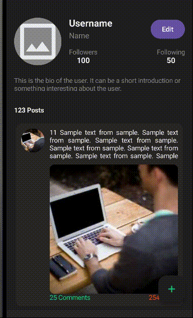
Result
I got help from AI when I stucked at some points. I know that AI is not updated with the compose libraries that is changing continuously but if you give it the updated library’s required code, it helps you and give you different ways to do it. Happy coding to all silent coders :))


