Custom SearchBar with Jetpack Compose
You know that Jetpack Compose libraries are updated quite often, and I could not use their SearchBar composable for our app effectively due to some limitations. Therefore, I decided to create my own search bar.

1. Code
I have used a generic T variable to make this implementation applicable for general use with any item type. As you can see, we do not have any specific data class in this composable. When you implement it in your screens, you need to specify the item list, how it will be displayed under the search bar after a search, the filter type, and, if desired, the height of the search bar (the default value is 30.dp).
This search bar also includes a filter icon next to the search box. You can open a filter screen if you have a UI for it. To do this, add an onFilterClick parameter to this function and pass it to the filter icon's onClick argument. In this article, I didn't implement this feature to keep things simple. If you don't need it, you can remove that part from the code below.
@Composable
fun <T> CustomSearchView(items: List<T>,
                         itemContent: @Composable (T) -> Unit,
                         filter: (T, String) -> Boolean,
                         searchBarHeight: Dp = 30.dp) {

    var query by remember { mutableStateOf(TextFieldValue("")) }
    val keyboardController = LocalSoftwareKeyboardController.current
    var isSearchActive by remember { mutableStateOf(false) }

    Column(
        modifier = Modifier
            .fillMaxWidth()
            .padding(top = 5.dp, start = 5.dp, end = 5.dp, bottom = 0.dp)
    ) {
        Row(modifier = Modifier
            .fillMaxWidth()
            .height(searchBarHeight),
            verticalAlignment = Alignment.CenterVertically){
            Row(
                modifier = Modifier
                    .weight(1f)
                    .background(ColorTextFieldContainerDefault, shape = MaterialTheme.shapes.large)
                    .padding(horizontal = 8.dp)
            ) {
                BasicTextField(
                    value = query,
                    onValueChange = { newValue -> query = newValue },
                    singleLine = true,
                    textStyle = LocalTextStyle.current.copy(fontSize = 18.sp, color = ColorTextPrimary),
                    modifier = Modifier
                        .weight(1f)
                        .padding(horizontal = 8.dp, vertical = 3.dp),
                    keyboardOptions = KeyboardOptions.Default.copy(
                        imeAction = ImeAction.Search
                    ),
                    keyboardActions = KeyboardActions(onSearch = {
                        keyboardController?.hide()
                        // Handle search action
                    }),
                    decorationBox = { innerTextField ->
                        if (query.text.isEmpty()) {
                            Row(verticalAlignment = Alignment.CenterVertically){
                                Icon(
                                    imageVector = Icons.Default.Search,
                                    contentDescription = "Search",
                                    tint = ColorTextSecondary
                                )
                                Text("Search...", color = Color.Gray, fontSize = 18.sp)
                            }
                            isSearchActive = false
                        }

                        isSearchActive = true
                        innerTextField()
                    }
                )

            }
            IconButton(onClick = { /* Handle filter action */ }) {
                Icon(
                    painter = painterResource(id = R.drawable.ic_filter),
                    contentDescription = "Filter",
                    Modifier.size(searchBarHeight),
                    tint = ColorTextSecondary
                )
            }
        }


        Spacer(modifier = Modifier.height(8.dp))

        if (isSearchActive && query.text.isNotEmpty()) {
            LazyColumn() {
                items(items.filter { filter(it, query.text) }) { item ->
                    itemContent(item)
                }
            }
        }

    }
}
2. Implementation
Below, you see the implementation of the CustomSearchBar. Inside it, there’s another composable named SearchListViewForPlant. This composable is a UI design for my specific data class type. You can set it up according to your needs. Alternatively, you can directly put a Text composable here instead of this composable function.
CustomSearchView(
    mockListOfPlants, //list of items
    itemContent = { plant ->  //UI design for list view
        SearchListViewForPlant(plant = plant)

    },
    filter = { plant, query -> //filter query algorithm
      plant.plantId.contains(query, ignoreCase = true)
    }
)
This below fuction “SearchListViewForPlant ”is my specific composable to show list items.
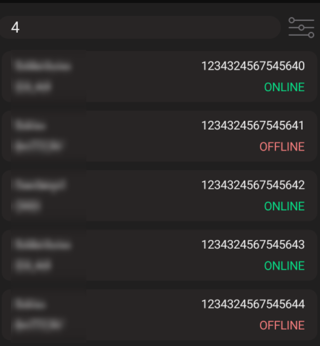
@Composable
fun SearchListViewForPlant(plant: Plant){

    Card(
        modifier = Modifier
            .padding(5.dp)
            .fillMaxWidth()
            .height(60.dp),
        shape = RoundedCornerShape(size = 10.dp),
        colors = CardDefaults.cardColors(
            containerColor = ColorTextFieldContainerDefault,
        ),
        onClick = {}
    ) {
        Column(modifier = Modifier.fillMaxSize(),
            verticalArrangement = Arrangement.Center){
            Row(Modifier.height(25.dp)
                .fillMaxWidth()
                .padding(horizontal = 15.dp, vertical = 4.dp),
                horizontalArrangement = Arrangement.SpaceBetween){
                Text(
                    text = plant.city,
                    color = ColorTextPrimary

                )

                Text(
                    text = plant.plantId,
                    color = ColorTextPrimary
                )
            }

            Row(Modifier.height(25.dp)
                .fillMaxWidth()
                .padding(horizontal = 15.dp, vertical = 4.dp),
                horizontalArrangement = Arrangement.SpaceBetween){
                Text(
                    text = plant.type.toString(),
                    color = ColorTextPrimary
                )

                Text(
                    text = plant.currentStatus.toString(),
                    color = if(plant.currentStatus == PlantStatus.ONLINE) ColorOnline
                    else ColorOffline
                )
            }

        }
    }

}
Summary
I wanted to share this custom search bar example to show that developers don’t need to rely solely on ready-to-use composables from the Jetpack team. With some basic knowledge of UI design using Jetpack Compose, anyone can quickly and effectively create their own custom composables.
Happy coding! :))
